Creating Beautiful and Interactive Data Visualizations with Python: A Complete Guide to Plotly (Cheat Sheet & Tips)

Plotly is a popular Python library that makes creating interactive and visually appealing data visualizations a breeze.
In this article we will go step by step; covering everything from basic graph creation with Plotly to advanced techniques.
Why Use Plotly?
Interactivity
Plotly allows you to create stylish, modern, interactive graphs effortlessly. You can hover over data points to view details, zoom in and out, and pan through the graph intuitively.
HTML Output
Charts generated by Plotly can be exported as HTML, making it easy to embed them into websites and internal tools.
Simplicity of plotly.express vs. Flexibility of plotly.graph_objects
For quick and easy visualizations, plotly.express is the best choice. If you need more control over the details, plotly.graph_objects provides greater customization.
Let's explore each of them.
Step 1: Understanding Plotly Express Basics for Quick Data Visualization
First, we will learn how to create various types of visualizations using Plotly Express. Understanding its fundamental concepts will help in using Plotly effectively.
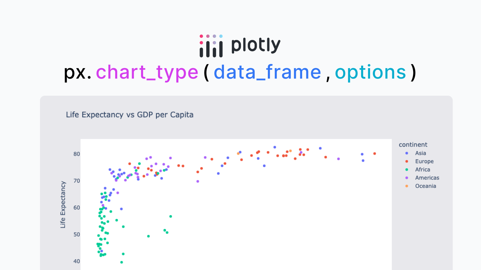
1.1: px.{chart_type}
The basic syntax for creating visualizations in Plotly Express follows the format: px.{chart_type}(). Knowing the available chart types makes it easier to use Plotly.
Main Chart Types
- Bar Chart:
px.bar() - Line Chart:
px.line() - Scatter Plot:
px.scatter() - Area Chart:
px.area() - Pie Chart:
px.pie() - Histogram:
px.histogram() - Box Plot:
px.box() - Violin Plot:
px.violin() - Heatmap:
px.density_heatmap() - Map (Scatter):
px.scatter_mapbox() - Map (Line):
px.line_mapbox() - Choropleth Map:
px.choropleth() - Pair Plot:
px.scatter_matrix() - Sunburst Chart:
px.sunburst() - Treemap:
px.treemap()
1.2: Passing DataFrames
Functions like px.bar() and px.line() take a DataFrame as the first argument, which will be the data source for the visualization.
1.3: Understanding Basic Options
Common options: title, subtitle, color, labels
- title: The title displayed at the top of the graph.
- subtitle: The subtitle displayed below the title.
- color: Specifies the color used for column differentiation.
- labels: A dictionary that allows renaming axis labels and properties.
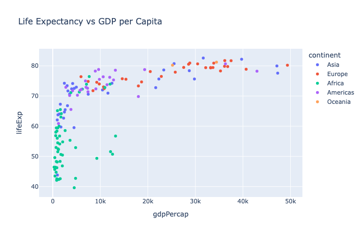
import plotly.express as px
gapminder2007 = px.data.gapminder().query('year == 2007')
fig = px.scatter(
gapminder2007, # DataFrame
x='gdpPercap',
y='lifeExp',
color='continent',
title='Life Expectancy vs GDP per Capita',
labels={'gdpPercap': 'GDP per Capita', 'lifeExp': 'Life Expectancy'}
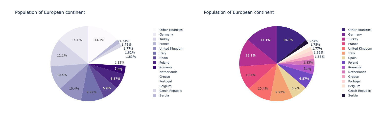
)Options for One-Dimensional Charts (Pie Charts & Bar Charts): value, names
Let's look at options specific to one-dimensional charts, such as pie charts and bar charts.
- value … The column specified in value is treated as the series' numerical value.
- names … The column specified in names is used as the label for the series.
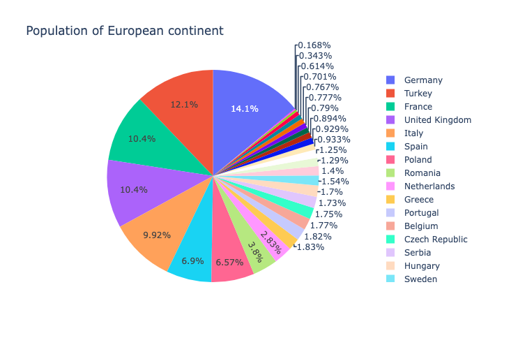
df = px.data.gapminder().query("year == 2007").query("continent == 'Europe'")
df.loc[df['pop'] < 2.e6, 'country'] = 'Other countries' # Represent only large countries
fig = px.pie(
  df,
  values='pop',
  names='country',  # Germany, Turkey, France ...
  title='Population of European continent'
)
Options for Two-Dimensional Graphs (XY Graphs): x, y, orientation, text
Options for charts that consist of an X-axis and Y-axis, such as bar charts and line charts.
- x … The column name used for the x-axis.
- y … The column name used for the y-axis. orientation … If set to 'v', the x-axis is horizontal and the y-axis is vertical. If set to 'h', the opposite applies. The default value is 'v'.
- text … The column name to be displayed as text in the chart.
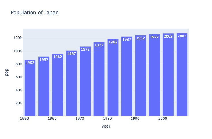
jp_pop = px.data.gapminder().query("country == 'Japan'")
fig = px.bar(
  jp_pop,
  y='pop',
  x='year',
  title='Population of Japan',
  text='year'
)
Step 2: Customizing Charts
2.1: Changing Chart Colors: color_discrete_sequence
To change chart colors, use color_discrete_sequence or color_discrete_map.
- color_discrete_sequence: Accepts an array of colors (CSS color codes like
'red','#ff0000'). - color_discrete_map: Specifies colors using a dictionary where keys are category names and values are color codes.
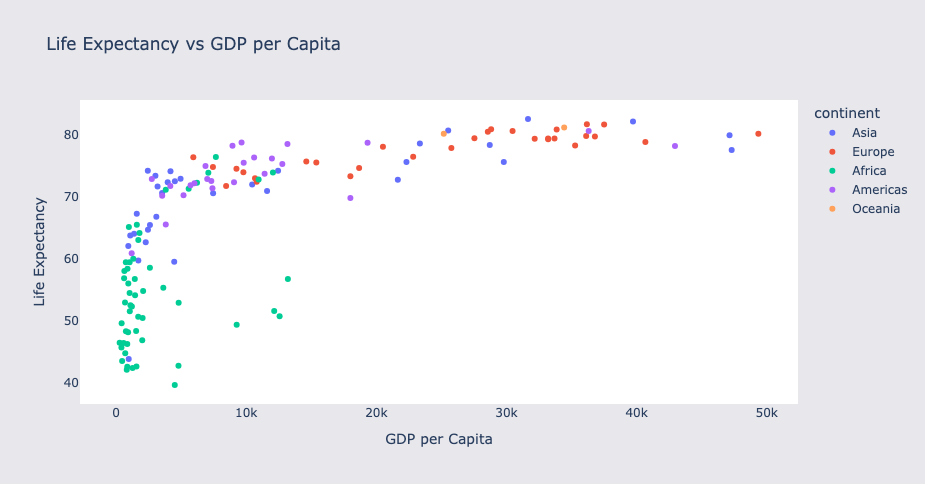
2.2: Modifying Hover Content: hover_name, hover_data
Use hover_name and hover_data to change the hover content.
fig = px.scatter(
gapminder2007,
x='gdpPercap',
y='lifeExp',
color='continent',
size='pop',
size_max=60,
hover_name='country'
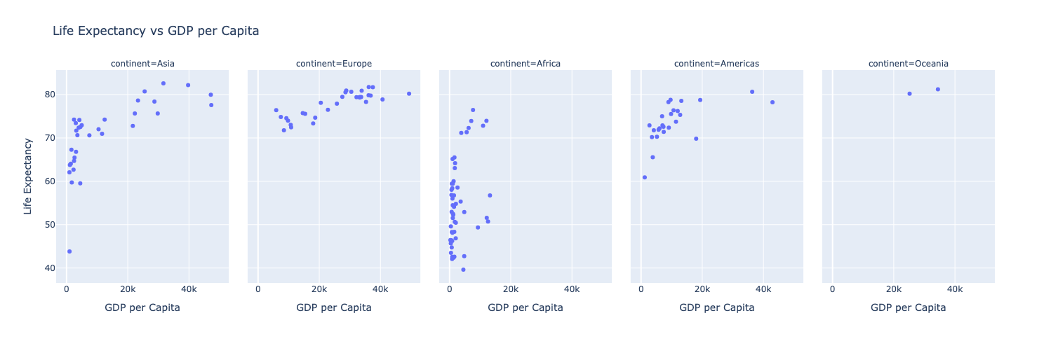
)2.3: Faceting: facet_col, facet_row
facet_row and facet_col automatically split data into multiple subplots based on the values in a specified column.
gapminder2007 = px.data.gapminder().query('year == 2007')
fig = px.scatter(
  gapminder2007,
  x='gdpPercap',
  y='lifeExp',
  title='Life Expectancy vs GDP per Capita',
  labels={'gdpPercap': 'GDP per Capita', 'lifeExp': 'Life Expectancy'},
  facet_col='continent',
)
2.4: Animations
Use animation_frame and animation_group to create animations.
gapminder = px.data.gapminder()
fig = px.scatter(
  gapminder,
  x='gdpPercap',
  y='lifeExp',
  color='continent',
  size='pop',
  animation_frame='year',
  animation_group='country'
)
Step 3: Advanced Customization with fig.update_layout()
You can further customize charts created with px.bar(), px.pie(), etc. using .update_layout().
3.1: Setting Fonts
fig.update_layout(
    font_family="Courier New",
    font_color="blue",
    font_size=14,
    title_font_family="Times New Roman",
    title_font_color="red",
    legend_title_font_color="green"
)
3.2: Changing Background Colors
fig.update_layout(
  paper_bgcolor='#E8E8EC',
  plot_bgcolor='#F9F9FB'
)
Next Steps: Embedding Plotly in Web Applications
Plotly Dash
Plotly Dash is a dashboard-building framework provided by the Plotly team. It allows you to create UI layouts and control interactions using only Python, without requiring HTML or JavaScript.
Morph
Morph is a framework for building web applications using Python and Markdown. It enables easy creation of interactive and visually appealing web applications.
https://docs.morph-data.io/docs/en/getting-started/why-morph
$ pip install morph-data
$ morph new my_project

$ cd my_project
$ morph serve
Plotly.js
For JavaScript-based applications, you can use Plotly.js to integrate charts directly into front-end applications.
Related Articles